| View previous topic :: View next topic |
| Author |
Message |
Kiri

Joined: 13 Jun 2009
Posts: 471
Location: Latvia/Italy
|
 Posted: Sun May 29, 2011 9:02 am Post subject: TL script Posted: Sun May 29, 2011 9:02 am Post subject: TL script |
 |
|
Finally I have the means to show this to y'all and ask for your opinion.
Does the script feel thorough? As in, do any of the letterforms seem out of place? What can you guess just by seeing it?
EDIT: This version is no longer correct. Please, see the new version below.
Last edited by Kiri on Mon Oct 17, 2011 7:34 am; edited 1 time in total |
|
| Back to top |
|
 |
Tolkien_Freak

Joined: 26 Jul 2007
Posts: 1231
Location: in front of my computer. always.
|
| Posted: Sun May 29, 2011 7:32 pm Post subject: |
|
|
It looks great! I don't really think any of the letterforms are out of place.
The dots here and there make me think it's an abjad. Is it? |
|
| Back to top |
|
|
Kiri
Joined: 13 Jun 2009
Posts: 471
Location: Latvia/Italy
|
| Posted: Mon May 30, 2011 12:24 pm Post subject: |
|
|
No, it is an alphabet. The dot changes unvoiced consonants into voiced ones (with the exception of /4/-->/r/ ), and the hook is a universal equivalent of the various diacritics I use in the romanisation  |
|
| Back to top |
|
|
Tolkien_Freak
Joined: 26 Jul 2007
Posts: 1231
Location: in front of my computer. always.
|
| Posted: Mon May 30, 2011 3:07 pm Post subject: |
|
|
| Oh, awesome! |
|
| Back to top |
|
|
Kiri
Joined: 13 Jun 2009
Posts: 471
Location: Latvia/Italy
|
| Posted: Mon May 30, 2011 5:22 pm Post subject: |
|
|
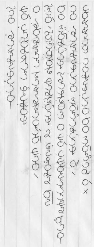
In case anyone wants it, here's the romanisation:
Ai bamrengai
Lì gaorhas ņexin
I boumas tamptaiō lai,
Zì, Fāvot lardģan u ťehiru ̄
Oi ōrģan Bandiz i lì glssalu qai
Ai bamrengai zōarģan í,
Kommaf airengai oi sōar í arj́n |
|
| Back to top |
|
|
eldin raigmore
Admin

Joined: 03 May 2007
Posts: 1621
Location: SouthEast Michigan
|
| Posted: Wed Jun 01, 2011 5:54 pm Post subject: |
|
|
Are the words in each line read top-to-bottom?
Is the first line on the left and the last line on the right?
It looks great so far, but, to really consider it critically and make useful remarks, I'd need to sort of learn how to read it.
Do you have, somewhere, a list of the sound-values of the characters?
Maybe one of us (me, for instance) should also try to write in it. That could also make it easier to make a worthwhile remark.
Thanks for posting!
____________________________________________________________
BTW: How were people writing it when it was invented? Chiseled into stone? Carved with a knife in wood? Punched into clay with a stylus? Brushed onto some paper-like surface, maybe parchment or velum or banana leaves or some such? Written with a quill-pen on some surface, and if so what surface? Rubbing a (sorta kinda) sharp(ish) piece of lead on a sheet of something?
All of that -- what they wrote with and what they wrote on -- can help answer the question about how coherent a set of letter-forms it is.
_________________
"We're the healthiest horse in the glue factory" - Erskine Bowles, Co-Chairman of the deficit reduction commission |
|
| Back to top |
|
|
Kiri
Joined: 13 Jun 2009
Posts: 471
Location: Latvia/Italy
|
| Posted: Thu Jun 02, 2011 9:24 am Post subject: |
|
|
The direction is top to bottom, left to right.
I will make a comprehensible value table and post it soon. It'd be great if someone else attempted to write in it!
The traditional way is to write it on bamboo or wooden slips with ink-ish methods (  ) )
( http://en.wikipedia.org/wiki/Bamboo_slips )
I imagine that there could be a kind of block-letters for engraving on stone or something like that |
|
| Back to top |
|
|
eldin raigmore
Admin
Joined: 03 May 2007
Posts: 1621
Location: SouthEast Michigan
|
| Posted: Sun Jun 05, 2011 8:28 pm Post subject: |
|
|
| Kiri wrote: | The direction is top to bottom, left to right.
I will make a comprehensible value table and post it soon. It'd be great if someone else attempted to write in it!
The traditional way is to write it on bamboo or wooden slips with ink-ish methods ( :D )
( http://en.wikipedia.org/wiki/Bamboo_slips )
I imagine that there could be a kind of block-letters for engraving on stone or something like that :) |
Looking up your link, it seems that writing a vertical script on bamboo strips or wooden strips, favors horizontal lines in the characters; and unless I am mistaken vertical lines are next-most-favored; but diagonal lines and curves are also frequent.
Curves in characters are highly dis-favored in carving on stone; straight lines in any direction seem, if I am not mistaken, to be about equally preferred as in any other direction, for forming characters.
Carving on wooden strips (e.g. Ogham), as opposed to inking on them, seems to prefer lines in perhaps just two directions, depending on the grain of the wood. The two directions don't seem to be perpendicular to each other. Maybe lines in a third direction come up every once in a while; also, maybe curves are more frequent on wood than on stone, though still not very frequent at all.
Using a pen or quill on banana leaves or palm leaves, like some South Asian scripts, likes vertical lines, but abhors horizontal lines; curves are used instead of horizontals.
Writing with a stylus pressed on clay or wax prefers triangles made with the point to round circular depressions made with the other end, but both occur.
Anything hollow (such as drawing a hollow triangle or hollow quadrilateral or hollow circle) is much dis-preferred; in advanced stylus-in-clay scripts it doesn't occur at all.
The triangles can be pressed in at any angle, but just two seem to be preferred; vertical (pointing up) and diagonal (pointing "northwest", that is, up and to the left).
Horizontal triangles, pointing to the left, also occur, maybe about as frequently as circular and semi-circular depressions made with the other end of the stylus.
Since the stylus may have, say, three or four edges, there may actually be two or three types of triangles; for instance, very narrow (say 30 degrees or less) and very wide (say 75 degrees or more).
As you are probably aware Braille characters look very little like the Latin letters and Arabic numerals they are equivalent to.
_________________
"We're the healthiest horse in the glue factory" - Erskine Bowles, Co-Chairman of the deficit reduction commission |
|
| Back to top |
|
|
Kiri
Joined: 13 Jun 2009
Posts: 471
Location: Latvia/Italy
|
| Posted: Sun Oct 09, 2011 9:05 pm Post subject: |
|
|
The script has undergone a bit of change, and I'm still looking for a different letterform for [O], otherwise [Oi] looks really weird as a combination.
I will try to do it within this week and post the results anytime soon... But, as you know, these things tend to get out of hand |
|
| Back to top |
|
|
eldin raigmore
Admin
Joined: 03 May 2007
Posts: 1621
Location: SouthEast Michigan
|
| Posted: Mon Oct 10, 2011 7:33 pm Post subject: |
|
|
I look forward to it. I think we all look forward to it.
_________________
"We're the healthiest horse in the glue factory" - Erskine Bowles, Co-Chairman of the deficit reduction commission |
|
| Back to top |
|
|
Kiri
Joined: 13 Jun 2009
Posts: 471
Location: Latvia/Italy
|
| Posted: Mon Oct 17, 2011 7:43 am Post subject: |
|
|
Ok, I finally did it. I made some changes, so the above example is no longer correct. Any feedback would be greatly apreciated
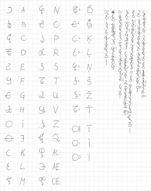
As you can see in the example, parts of the letters get lost when combined with others, especially the little "legs" in <c q ao oe> and "heads" in <c q r>.
If you want to, feel free to try writing something to tell me.
My main question still stands - does this seem like a realistic, usable script that could've actually evolved for a language? |
|
| Back to top |
|
|
Kiri
Joined: 13 Jun 2009
Posts: 471
Location: Latvia/Italy
|
| Posted: Mon Oct 24, 2011 8:02 pm Post subject: |
|
|
| bump? |
|
| Back to top |
|
|
eldin raigmore
Admin
Joined: 03 May 2007
Posts: 1621
Location: SouthEast Michigan
|
| Posted: Tue Oct 25, 2011 5:25 pm Post subject: |
|
|
Oops!  Sorry. Sorry. 
| Kiri wrote: | Ok, I finally did it. I made some changes, so the above example is no longer correct. Any feedback would be greatly apreciated
http://i78.photobucket.com/albums/j84/hentaidemon/IMG-1.jpg
As you can see in the example, parts of the letters get lost when combined with others, especially the little "legs" in <c> and "heads" in <c>.
If you want to, feel free to try writing something to tell me.
My main question still stands - does this seem like a realistic, usable script that could've actually evolved for a language? |
To critique it more thoroughly I'd need to try to write in it, which I haven't yet done and don't yet know whether I'll have the time soon (like today -- though that's a possibility).
But to answer your main question; Yes, it does to me, but I'm no expert.
Thanks for the effort, and thanks for thinking of us!
_________________
"We're the healthiest horse in the glue factory" - Erskine Bowles, Co-Chairman of the deficit reduction commission |
|
| Back to top |
|
|
LingoDingo
Admin

Joined: 25 Oct 2011
Posts: 102
Location: Eastern US
|
| Posted: Mon Oct 31, 2011 5:58 pm Post subject: |
|
|
The only thing that seems out of place to me is the m character.
It's quite a bit more sharp than the other ones.
_________________
Fluent or nearly fluent in: English, Japanese, German
Mildly capable in: Spanish, Russian, French, Chinese
Constructed Languages: Aalsen, Aalmok Repurpose, Samamisu
.aď sodai peťâs sokâs na asnâ;ustâs buntai mokâ aaťal. - One never truly knows a culture until they learn its language. |
|
| Back to top |
|
|
Kiri
Joined: 13 Jun 2009
Posts: 471
Location: Latvia/Italy
|
| Posted: Fri Apr 27, 2012 9:47 pm Post subject: |
|
|
The character for M is indeed quite different, but I like it a lot and I don't think it stands out in an ugly way
(I've since adjusted the script a bit more, but the changes are quite minute as far as my questions stand ) |
|
| Back to top |
|
|
|


